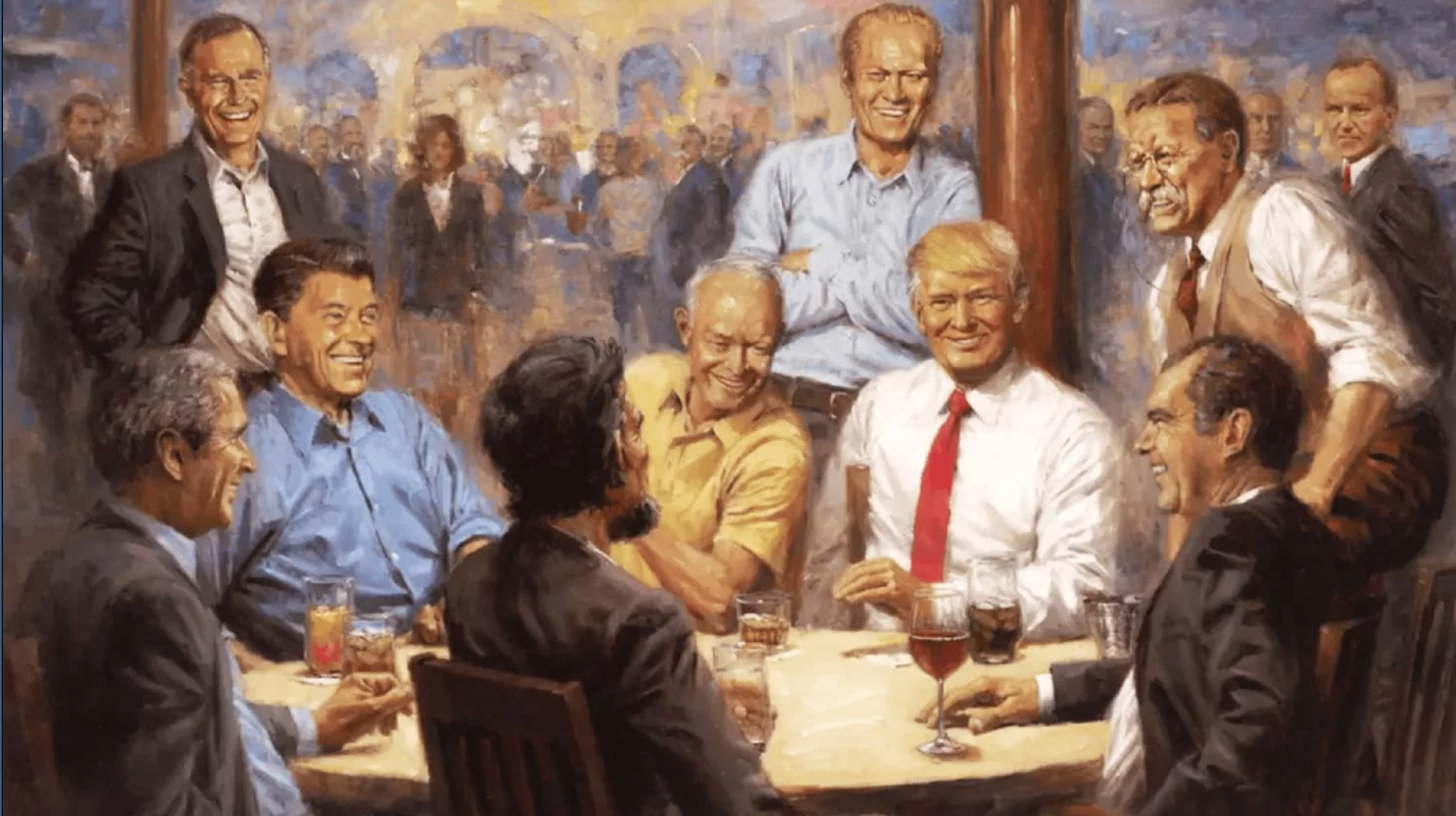
How might an art professor talk with students about “The Republican Club,” Andy Thomas’s painting of Donald Trump surrounded by notable Republican presidents of years past? Is it any good? What if a student painted it? I put the questions to my Sonoma State University colleague, Clea Felien, who trained at The Atelier, a 19th Century French Academic portrait painting school with a direct lineage to Jacques Louis David, and studied with Cyd Wicker, who has painted portraits of Presidents Jimmy Carter, Ronald Reagan, and Bill Clinton for the Presidential Museum in Odessa, Texas. Is it possible to talk about the painting in the classroom without talking about politics?
¤
HOLLIS ROBBINS: What do you make of the painting?
CLEA FELIEN: Well, to start off, the composition of this painting is good. I’ll have to give it that. The artist is using classic historic rules of composition. You see the painting has numerous ‘golden triangles,’ a composition rule for painters which takes the viewer’s eye in a triangular route around the painting to break the rectangle of the canvas. A triangle moves your eye all around the whole picture.
So the painter knows what he’s doing…
Yes. He’s making us look, making our eyes move from figure to figure. Look at the front row of men in dark suitcoats moving from the right with Richard Nixon to the left to Bush Jr. and up the side of the canvas to Bush Sr. There is a blue diagonal line which brings your eye from the bottom left of canvas to the upper right through the shirts of Bush Jr., then Ronald Reagan, then Gerald Ford and then landing at small blue square in the upper right corner. And look at the beige diagonal from the vest of Teddy Roosevelt in the upper right corner to Dwight Eisenhower to the soda near Bush Jr.’s hand. These diagonals are countered by the vertical poles that Ford and Bush Sr. are leaning on. And do you see the white shirts of Bush Sr., Trump and Roosevelt? They create an inverted golden triangle.
And it’s all meant to emphasize Trump?
Absolutely. The red ties from Trump to Roosevelt to the guy in the way back [Coolidge] emphasize Trump as the central figure. Eisenhower, Nixon, and Roosevelt are all leaning toward Trump, further emphasizing Trump. And I have to say that the rendering of the figures for a student is good. The faces have value and color that is believable. Trump’s posture is very straight and upright, the only one in the painting that way. Trump is the only figure in the white shirt with no coat. There is a soft-focus party off in the distance. Everyone is smiling. There are teeth showing on everyone but Trump. Teeth are hard to do well. For Trump, teeth showing could be a sign of being too casual or weak, guard down.
So would this be an A painting, for an undergraduate? What would you tell the student?
Well, the problems with this painting are not its composition or palette or even its rendering. I’d point out that the painting has an overall saccharine sensibility. All the men have similar shaped heads and bodies. All the skin tones are the same. There is no depth in any of the presidents. This is a novelty illustration of a hypothetical moment.
I see what you mean. Nobody’s face shows any trace of crisis or a tough decision about going into battle.
Exactly. The difference between art and illustration is that art challenges you to think for yourself, and illustration tells you what to think, gives you the answers. Art presents questions and digs into cultural moments, like Picasso’s Guernica, or David’s Death of Marat. Art does not anesthetize the viewer. Art is a form of communication that allows for the viewer’s interpretation. With these characters the painting should be a novel, not a cartoon strip.
There’s no room for interpretation.
What’s to interpret or question? The painting says everything is under control. But art is not about control. Art is about moving the culture forward, about the preverbal understanding of historical moments. Good art inspires critical thinking about social and cultural moments.
So what’s the appropriate political critique for the classroom? If a student painted it, your concern can’t be that the figures belong to one political party or that it hangs in Donald Trump’s White House.
That is a little trickier. On the one hand, this painting is perfect for the current tenor of the administration. It is telling us to be calm, everything is under control. Have a drink and relax, a Coke and a smile. One way the painting does this is by adhering to rules of what is called “Truth and Beauty.” Recent art history has decided that there are certain “truths” in art, these being accurate rendering of humans, landscapes etc. “Beauty” usually refers to attractive young white people or a pretty landscape. So, on the other hand, “Truth and Beauty” is political. It is in fact reflective of what Adolf Hitler liked in painting. Consider the show Truth and Beauty: The Pre-Raphaelites and the Old Masters, the recently ended show at The Legion of Honor in San Francisco. These are fantastic paintings, by fantastic painters. However, the painters are all old white men, and the paintings exemplify wealthy white people. This is not everyone’s version of truth or everyone’s ideal of beauty.
So it’s a little like American history textbooks that leave out details about slavery or Native American genocide?
Exactly. It is also important to note that Andy Thomas painted almost the exact same painting of Obama with all the Democrat presidents. The only difference here, and this is the very important part, the interesting part, and I think the part that actually is art, is that Trump put it up in the Oval office. This is what we need to think about. Trump is being honest about who he is and what he wants us to think and feel about: nothing.
The art is the art of nothingness?
Yes. The painting is a novelty illustration, a happy, calm, saccharine illustration of a moment where nothing happens. There is nothing challenging in the painting’s subjects the content of the painting or in the way it is painted. The artist has done this before for the Democrats, so he has no real party affiliation. This image was made for posters and placemats and other novelty items. But President Donald Trump has decided this is art worthy of display in the Oval Office. By contrast, President Obama chose Kehinde Whiley to paint his official White House Portrait, Michelle Obama chose Amy Sherald. These artists are serious contemporary artists with an abundance of content critical thinking and context in their brush stroke, paint application, composition, content, style etc. And Trump chose the placemat illustration.
What about the comparison some make to Norman Rockwell, whose work at one time was seen as saccharine and unsophisticated?
I love Norman Rockwell! Norman Rockwell was a brilliant painter technically. He was considered an illustrator because his message was always very literal. He was political, of course. Consider “The Problem We All Live With,” his painting of Ruby Bridges. But Rockwell was technically a much better painter than Andy Thomas. The Trump painting is soft focus, sanitized, fantasy, with a predictable composition. Norman Rockwell might look old fashioned to some people but he offered new composition and subject matter strategies. We don’t see that here.
So what would you tell your student?
That art has politics that aren’t party politics — though it certainly looks like they’re having a party here.