“Cool” can mean many things. More often than not, it is a quality applied to people.
In March, an exhibition titled America’s Cool Modernism opened at the Ashmolean Museum, in Oxford. Exploring the idea of “cool” in the art of the interwar period, this exhibition brings together some of the leading figures of American modernism. As the majority of paintings and prints on display at America’s Cool Modernism, are devoid of human figures, I am inspired to look around me. Are these people cool? Do “cool” exhibitions attract “cool” people? Is it really a characteristic that Americans, in particular, possess?
At 10:20 a.m. on a Tuesday morning, most of the people who surround me are elderly and probably British; not that this excludes them from the category, but it is hardly stereotypical. Instead, I imagine a guy in a leather jacket, white t-shirt, and shades — a James Dean-type figure. No one looks like this, me especially. Yet, the link between coolness and a concern for appearance is not totally irrelevant; for how the concept of cool is conveyed visually provides the exhibition’s through-line.

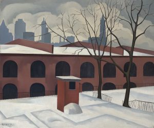
The concept is an intriguing one, and it manifests in a variety of thoughtful and exciting ways across the great range of works featured at the Ashmolean. The snowy city scenes of Georgia O’Keefe and George Ault provide us with easy examples. Here, both color and content suggest a sense of wintry cold. O’Keefe’s East River from the Shelton Hotel (1928), a panoramic view from the heights of New York’s snow-topped buildings, stands out in a room where pictures of skyscrapers ascend in verticals. On another wall, Ault’s less known but equally eerie View from Brooklyn (1927) offers a counterpart from the river’s bleak other side. A blanket of crisp snow rests on the roof tops, while the bare branches of the winter trees intersect an oddly illuminated, yet cloudy sky.
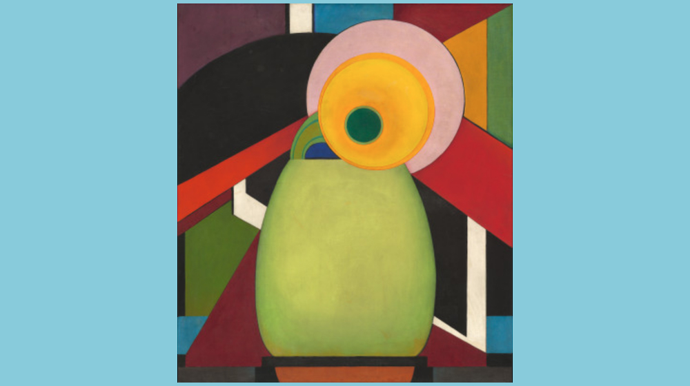
For the curators of the exhibition, however, “cool” has a subtler meaning. They interpret “cool” as a form of detachment. This idea connects the early American experiments in abstraction of the first room, such as Edward Steichen’s reductive rendering of a sunflower in Le Tournesol (1920), to the introspective cityscapes of Edward Hopper, with which the exhibition ends. The effect is more than a little unsettling: normally, “cool” is considered a term of approval, but a sense of ambiguity and equivocation pervades the pictures here.
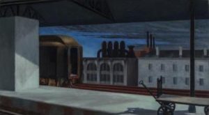
To start with the end, three large paintings by Hopper evoke the empty loneliness of American urban life to the point of palpability. In Dawn in Pennsylvania (1942), the low roof of a train station intersects with factory smoke clouds to create an impression of oppression that is unlikely to lift with daybreak. On the far side, an immobile carriage emerges from behind a platform column but lacks the momentum expected of it. The resulting scene is silent and still, although quiet turns to disquiet fast.
Evidently, this is not “cool” in the sense of the popular and positive, but the depopulated and distant. In line with this, the first few rooms of the exhibition feature examples of a nascent abstract art. Here, we are confronted with an abundance of geometric shapes. From the puzzle pieces of Patrick Henry Bruce’s Peinture (1917-18) to the cubist-like rendering of Sound (1919) by E.E. Cummings, these works do not provide us with representations of reality that are easily recognisable. Like Steichen’s painting of the sunflower, they suggest a different way of looking and depicting the world, one that we are unaccustomed to and thus feel distanced from.
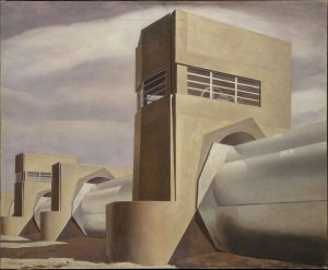
In between these first two rooms and the final room that feature the Hoppers, is the exhibition’s main gallery space. Again, by excluding the human figure, the artists included in this room chose to define America in terms of its built surroundings. Charles Sheeler is a key figure in this respect. Featuring examples of his photography and painting, the exhibition displays a terrific range of his works, and for good reason. His work excludes human presence and asserts that of domineering industrial buildings and structures instead. Take Water (1945), for example, where a seemingly abandoned water plant is set in an equally desolate desert. The effect is nondescript, the beige of the plant unremarkable against the overcast sky. Meanwhile, the absence of workers serves to deemphasize the plant’s functional role, as if its presence is simply a matter of fact.
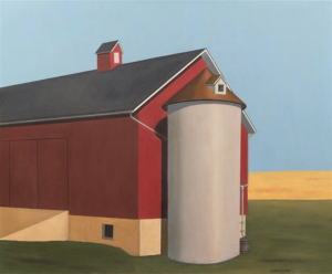
This kind of mechanical recording is not just thematic but formal. Certainly, Sheeler’s interest in America’s industrial and urban landscapes was shared by a number of the artists here, but so was his pursuit of representational exactitude and clarity. The term “precisionist” is often used to describe these characteristics. Coined by the director of the Museum of Modern Art (MoMA), Alfred H. Barr, in 1927, precisionism was a style that emphasized visual clarity and directness over subjective self-expression.[1] The resulting pictures often seem impersonal, marked by emotional restraint and control. It is in this sense that they appear cool, lacking the passion usually associated with individuality and artistic imagination. With subject matter drawn primarily from urban and industrial scenes, the artists associated with this movement depicted architecture typically considered American. From the soaring skyscrapers photographed by Sheeler and Paul Strand to the carefully painted, eerily still, grain elevators and silos of Ralston Crawford, the precisionists defined and promoted an art that was distinctly American.
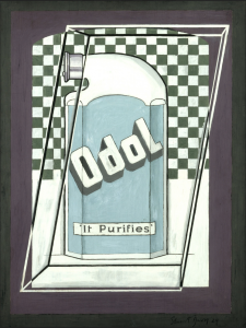
A new national self-consciousness defines the works here. As the curator Katherine M. Bourguignon writes, it was at this time that “the word ‘America’ became a shortcut to express an artist’s interest in new, modern forms of art-making as well as new native subjects.”[2] Futuristic depictions of city life and new technology such as Louis Lozowick’s New York (1925) or Arnold Rönnebeck’s Brooklyn Bridge (1925) convey this well. Both these lithographs suggest that dynamism and movement are integral to the city. The buildings in Lozowick’s print, for example, all meld together into one forceful downwards sweep, while Rönnebeck’s streamlining of the Brooklyn Bridge mirrors the new technological efforts used to maximize vehicular speed. Other pictures in this room, including Charles Demuth’s famous I Saw the Figure 5 in Gold, and Stuart Davis’s bold rendering of the mouthwash, Odol, also seem to look forward. Featuring strong outlines and making novel use of typefaces, they appear to anticipate the poster and advertising aesthetic of 1960s Pop Art.
If these works can be said to be visionary, then in the next room of the exhibition there is an interesting shift in tense. Here, we are orientated backwards, searching for a “usable past.” Seeking refuge from the city, the artists featured here turned their attention to the country’s rural spaces and quintessentially American designs. Familiar figures such as Sheeler and Grant Wood greet us, the former with a disorientating view of Americana (1931) inspired by vernacular objects, the latter with landscape lithographs. One of Grant’s prints is titled Fertility (1938) and features unrealistically neat rows of corn. In the background a barn and house stand motionless, the only indication of human life is that which has already been or yet to come. In O’Keefe’s large painting of Ranchoes Church (1930), a connection to the land is also crucial. The rocky forms of the building’s structure meld with the ground, becoming a mound of elemental shapes. What makes these subjects feel new is not their links to engineering invention or novelty, but rather their separation from the subjects and styles of Europe — the art of the “Old” World.
Coolness as a form of detachment is not lost in these works. In fact, the attempts to forge a national art and move away from cultural dependence on Europe corresponded with a much broader turn to isolationism. Focusing on the period following the First World War, the exhibition explores a time associated predominantly with policies of non-intervention and national introspection. The detached cool identified in the works of the exhibition thus assumes a meaning analogous to the isolationist tendencies of interwar America and its desire for distance from international affairs.
It seems fitting, then, that the exhibition brings together some of the leading figures of American modernism, as well as those who have rarely exhibited outside the United States. As the Museum’s director, Xa Sturgis, has stated: “it is almost impossible for the British public to see works by American artists from the first half of the twentieth century in public museums.”[3] Art history is to blame for this absence, in his opinion. The masterpieces of early American Modernism were overlooked in “the grand sweep of sequential art historical narratives,” thanks to a premature enthusiasm for the 1940s and Abstract Expressionism.
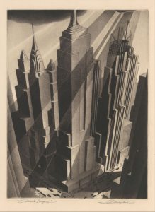
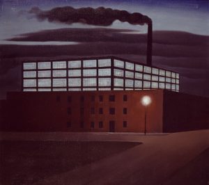
Yet, while the show’s byline proudly boasts the more well-known names “O’Keefe to Hopper,” the real gems of the exhibition are found in the less familiar. From the vertiginous viewpoints of William McNulty and Samuel Margolies’ prints to the empty cyan windows of Ault’s Hoboken Factory (1932), these pictures make a lasting impression, even if the names of their creators are only just beginning to. Indeed, their impact lies in the way they combine boldness with ambiguity and make us question our expectations of modern city life.
For an exhibition concerned with detachment, America’s Cool Modernism is paradoxically nothing but engaging. Together, the works on display distill the experience of interwar America into a powerful reflection on technological and cultural change. Yet, why the particular stylistic features shared by these artists came to signify American artistic identity is a question that involves careful consideration. While the precise, austere style adopted by some implies a certain coolness of tone, a big leap is needed to start assigning nationalities to visual representations and formal similarities. This requires us to interpret “cool” in the sense of the popular as well as the detached.
According to the writer Joel Dinerstein, the modern meaning of “cool” has its origins in the world of African-American Jazz. For him, the saxophonist Lester Young popularised the term in the mid-forties, using it to signal resistance in face of discrimination.[4] Two paintings from Jacob Lawrence’s Migration Series (1940-1), his epic depiction of the mass movement of African-Americans from the South to the Northern cities, may remind us of this origin; and the fact that spaces, even empty ones, are never as neutral or objective as they might appear. For the most part, however, this provenance remains obscure.
Peter Stearns’s American Cool: Constructing a Twentieth Century Emotional Style (1994) suggests a more likely source. “Cool. The concept is distinctly American”, he writes, the country’s dominant emotional “style.”[5] Gone are the days of Victorian romanticism, he argues, for a new culture of self-control and emotional suppression emerged in the 1920s and 1930s, the same period these artists were active. This chronological correspondence is intriguing, but so too is Stearns use of the term “style”.
Style is something we usually associate with or assign to art. It provides a means to locate similarities and mark differences, establish categories like national schools. For Stearns, too, style is evoked in order to make generalizations and claims for the collective. Indeed, it makes sense that we might want to characterize our eras in this way, for to be ‘stylish’ implies a certain sensitivity to the moment, the fashion of a particular time. Like “cool”, there is a relation to visuality and appearance, but more importantly a disguised subjectivity used to shape and select particular narratives under the pretense of an aesthetic objectivity. The “cool” artworks on display at the Ashmolean do something similar: while distance and detachment bring assumptions of an objective view, an underlying psychological angst feels latent, suggesting that, at any moment, they might lose their “cool”.